A saved folder can look impressive and still be nearly useless.
You may have hundreds of screenshots, beautiful campaign images, clever packaging ideas, color combinations, interiors, headlines, and photographs tucked across Pinterest, Instagram, your camera roll, and a collection of browser tabs. Yet when it is time to develop a concept, choose an art direction, or make a visual decision, none of it feels especially helpful.
The problem is rarely a lack of inspiration. It is the way that inspiration has been collected.
Learning how to build a creative reference library turns scattered visual material into something you can actually use. Instead of saving whatever catches your attention and hoping it becomes useful later, you begin collecting references with context, intention, and enough structure to support your work.
The result is not simply a prettier archive. It is a more perceptive creative practice.

Your Saved Folder Is Not Yet a Reference Library
An inspiration folder answers one question: Do I like this?
A creative reference library answers several more:
- What specifically is working here?
- Which decision made this feel distinctive?
- When might this reference be useful?
- What could I learn from it without recreating it?
- How does it relate to the work I want to make?
That distinction matters. When every saved image is reduced to a general mood, you lose the most valuable information inside it.
Perhaps you saved a campaign because of its unusual crop, not its overall aesthetic. Maybe the packaging is useful because of its information hierarchy. A photograph might interest you because the styling makes an ordinary subject feel expensive. A website may be memorable because its pacing gives each idea enough room to register.
The reference becomes useful when you can name the decision that caught your attention.
Decide What You Want Your Library to Help You Notice
Before choosing folders, tags, or software, decide what your reference library is for.
A photographer, copywriter, brand designer, content creator, and product-based business owner will notice different details in the same campaign. Your library should reflect the decisions you make regularly, not an abstract idea of what creative people are supposed to collect.
Start by listing the kinds of choices that tend to slow you down.
That list might include:
- Art direction
- Color relationships
- Composition and cropping
- Typography
- Packaging details
- Website layouts
- Prop and wardrobe styling
- Content formats
- Headlines and messaging
- Launch concepts
- Photography lighting
- Editorial pacing
- Presentation design
- Customer experience details
You do not need a category for every possible creative discipline. Choose the areas that repeatedly appear in your own work.
If you often stare at a blank page while planning a shoot, build a strong collection around composition, lighting, styling, and posing. If your work involves offers and launches, collect campaign themes, promotional sequences, sales-page structures, and memorable ways of presenting information.
A focused library will serve you better than an enormous one.

How to Build a Creative Reference Library You Will Actually Use
The most effective system is usually the least elaborate one that still helps you retrieve the right material.
You do not need an intricate database unless you genuinely enjoy maintaining one. A set of clearly named folders may be enough. The objective is not to build a flawless archive. It is to reduce the distance between “I remember seeing something useful” and “I can find it now.”
Choose one primary home
Your references can originate anywhere, but they should eventually arrive in one main location.
Depending on how you work, that might be:
- A Pinterest account with focused boards
- A visual database in your preferred workspace tool
- A cloud folder with clearly labeled subfolders
- A photo-organizing application with albums and tags
- A private presentation or digital mood-board file
- A physical binder for printed references and material samples
Choose the format you are most likely to open while working.
If your references remain split between screenshots, saved posts, downloads, and unlabeled links, you will continue relying on memory. A central home makes the collection searchable and gives you a fuller view of your recurring taste.
You can still capture ideas quickly in the moment. Simply create a small routine for transferring worthwhile references into the main library later.
Organize by creative decision, not by source
Folders labeled “Instagram,” “Pinterest,” or “Websites” tell you where something came from. They do not tell you why you saved it.
Organize around the decision the reference could help you make.
For example:
- Color: restrained palettes, unexpected accents, tonal combinations
- Typography: editorial pairings, expressive display type, small-scale details
- Photography: natural light, product composition, movement, close crops
- Messaging: headlines, offer positioning, calls to action, campaign language
- Layouts: service pages, lookbooks, sales pages, email design
- Details: buttons, packaging inserts, navigation, labels, printed matter
A single reference can belong in more than one category. That is useful, not untidy. A campaign image may be relevant to photography, color, and typography for different reasons.
The goal is retrieval. When you need to solve a layout problem, you should be able to open the layout collection without searching through everything you have ever admired.
Save context with the reference
A beautiful image without a note often becomes decorative clutter.
When you add something to your library, include one sentence explaining why it earned a place. It does not need to sound polished.
Try notes such as:
- “The dramatic crop makes a simple product feel more editorial.”
- “Useful example of a restrained palette that still has contrast.”
- “The headline is specific without becoming overly explanatory.”
- “Notice how the repeated shape connects the packaging to the photography.”
- “The layout alternates dense information with generous visual space.”
- “The styling feels personal because the objects look selected, not staged.”
This habit trains you to observe creative work more precisely. Over time, your notes may become more valuable than the images themselves because they reveal the principles you want to carry into future projects.
Keep the source whenever possible
Save the creator, studio, publication, photographer, or original link with the reference.
This is useful for attribution, but it also preserves the larger context. You may later want to study the full project, understand how the idea was applied across several touchpoints, or revisit the creator’s work.
A screenshot strips away much of that information. If you capture one, add the source before it disappears into your archive.
Collect fewer, better references
Ten images that each teach you something are more useful than two hundred versions of the same aesthetic.
Before saving another reference, ask:
- Is this meaningfully different from what I already have?
- Can I name the detail I want to remember?
- Is it relevant to the work I make or want to make?
- Would I be able to use this as a thinking tool later?
You do not need to be severe about it. Creative collecting should still be enjoyable. A small amount of discernment simply prevents the library from becoming another place you mindlessly scroll.
Build Temporary Collections for Active Projects
Your permanent reference library supports your broader creative practice. An active project needs a smaller, more selective collection.
When beginning a project, pull relevant references into a temporary working board. This is where you translate a large archive into a specific direction.
A useful project board might include:
- Two or three references for overall tone
- One or two examples of composition
- A concise color direction
- Typography or layout references
- One deliberately unexpected influence
- Notes explaining what should carry into the work
- Notes identifying what should not carry into the work
That final point is especially helpful. A reference can contain one brilliant idea alongside several choices that are wrong for your project. Naming the boundary keeps the direction specific.
For example:
Use the intimate crop and natural styling from this photograph, but not its muted brown palette.
Or:
Borrow the rhythm and information hierarchy from this page, but keep our existing type system and warmer visual tone.
This turns a mood board into a working brief.

Use References Without Copying Them
The safest way to avoid imitation is to stop treating the reference as a finished answer.
Break it into decisions.
If you love a campaign image, identify whether you are responding to:
- The scale of the subject
- The camera angle
- The lighting
- The amount of negative space
- The color contrast
- The styling
- The emotional tone
- The relationship between type and image
Then combine that observation with references from other disciplines.
A fashion photograph might influence the composition of a website hero. An interiors book could inspire a restrained packaging palette. The pacing of a magazine feature may help structure a presentation. A hotel’s welcome experience could inform how you deliver a digital product.
This cross-pollination creates more original work because you are translating a principle into a new setting, not reproducing its surface appearance.
A simple formula is:
Reference A for structure + Reference B for tone + your project’s actual requirements
Your brand, audience, offer, medium, and constraints should determine the final result. References are there to sharpen your decisions, not make them for you.
Notice the Patterns in What You Save
Once your library has some depth, review it as a collection.
You may begin to notice that you repeatedly save:
- Cropped compositions rather than perfectly centered ones
- Warm neutrals with one cooler accent
- Serif typography used at a dramatic scale
- Everyday objects photographed with precise styling
- Dense editorial layouts balanced by simple pages
- Personal language paired with disciplined design
- Materials with visible texture
- Campaigns that feel more like magazines than advertisements
These patterns are evidence of taste.
You do not have to apply every preference to every project. Still, knowing what repeatedly earns your attention helps you develop a creative point of view that is more specific than “I like beautiful things.”
You can turn those observations into a personal set of creative principles. For example:
- Use contrast with intention.
- Let one detail carry the personality.
- Prefer tactile imagery over glossy perfection.
- Edit until the central idea is obvious.
- Make practical information feel considered.
- Use trends as accents, not foundations.
These principles become especially helpful when several options are technically good. They give you a basis for choosing the one that feels most aligned with your work.
Give Your Library a Light Editing Routine
A reference library should evolve as your taste and work evolve.
Once a month or once a season, spend 20 minutes reviewing recent additions. You do not need to reorganize the entire archive.
Use that time to:
- Move strong references from your capture folder into permanent categories
- Add context to anything you saved too quickly
- Delete repetitive or no-longer-relevant material
- Repair missing source links
- Notice emerging patterns
- Create a temporary collection for an upcoming project
You may also find references that once felt exciting but now seem predictable. That does not mean you made a poor choice when you saved them. It means your eye has developed.
Allow the library to reflect your current standards instead of preserving every phase of your taste equally.
A Simple Creative Reference Library Workflow
If you want to begin without turning this into a project of its own, use this four-part workflow.
1. Capture
Save anything that creates a specific reaction or solves a problem you encounter often.
2. Clarify
Add a short note explaining what you noticed and preserve the original source.
3. Categorize
Place the reference under the creative decision it could help inform.
4. Curate
Review the library regularly and keep the material that still expands, clarifies, or strengthens your thinking.
That is enough structure to make the collection useful without making it burdensome.

Your References Should Lead You Back to Your Own Ideas
A well-built reference library does not give you a style to borrow. It helps you understand what you notice, what you value, and how you want your work to feel.
It also makes creative work less dependent on waiting for inspiration. When a project begins, you have a considered body of material to think with. You can identify useful principles, test combinations, and move toward a direction with more confidence.
Start with what you already have. Gather your strongest saved references into one place, remove the duplicates, and write a sentence about why each one matters. By the end, you will have more than an organized collection. You will have a clearer record of your creative point of view.
If you would like thoughtful support turning that point of view into a more cohesive brand or online presence, explore the ways to work with Reverie Maven.
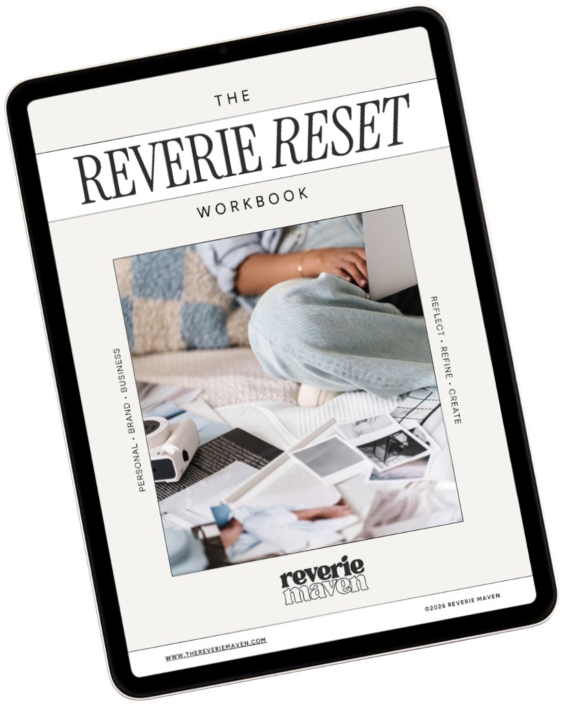
YOUR FREE STARTING POINT
Start with The Reverie Reset
A reflective workbook for reconnecting with yourself, getting clearer about what you genuinely want, and beginning to create a life and presence that feel more aligned, intentional, and fully your own.
Consider this your first step out of “someday” and toward what comes next.